Note: All charts below were created with Matplotlib and Seaborn.
This week at Metis, we worked on a group data analysis project. The objective of our analysis was to provide a recommendation for where a women in tech organization should place their volunteers in promoting their upcoming summer gala. With the gala set for a date in the beginning of the summer, my group decided to narrow our analysis to May, June and July of the last two years. We created several dataframes for our analysis, grouping the data entries at both the turnstile and the station level, as well as by time, date and month.
For each dataframe, we made the statistic of average passengers per hour a primary focus of our analysis. Our reason for this were that in maximizing overall impressions for the volunteers, they could maximize their conversion rate for promotion. In order to make sure that the volunteers would find commuters likely to attend/donate, we identified several priority stations for their proximity to tech companies in the city. As the gala was to be in the Lower East Side of NYC, we also prioritized stations that would provide a convenient route to the venue. The total number of priority stations amounted to 19. In sorting the top subway stations by overall passengers per hour across those six months (May, June and July for 2017, 2018), we found that six of our 19 priority stations made the cut into the top 40 and can be seen in orange in this chart.
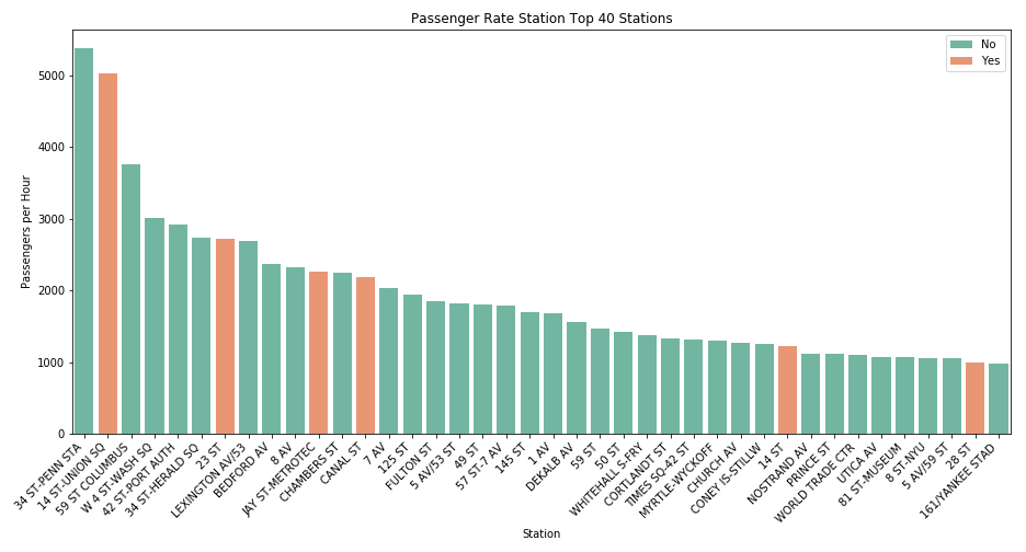
The top three of our priority stations for overall passengers per hour were 14 ST, 14 ST UNION-SQ and 23 ST. These were placed 2nd, 7th, and 11th for the city overall. Since all three were quite high in the overall rank for the city, we felt confident in focusing entirely on these three stations for the remainder of our analysis.
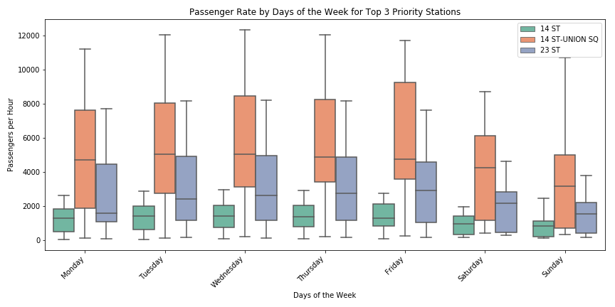
The chart below depicts passengers per hour by day of week for 14 ST, 14 ST UNION-SQ and 23 ST. While 14 ST is 1st, 14 ST UNION-SQ is 2nd and 23 ST is 3rd for every day of the week, the distributions appear to be relatively consistent between Monday-Friday, and lower on Saturday and Sunday. As a result, our recommendation suggested promotion during the week only, with no preference for a particular day Monday-Friday.
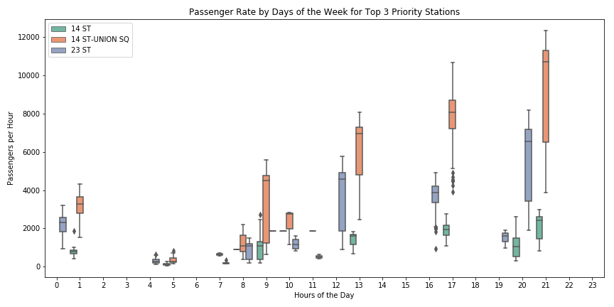
The chart below depicts passengers per hour by hours of the day for 14 ST, 14 ST UNION-SQ and 23 ST. Like the chart above, 14 ST is 1st, 14 ST UNION-SQ is 2nd and 23 ST is 3rd for every hour of the day. The window from 5:00pm–8:00pm though appears to have the largest values across all three stations. As a result, our recommendation suggested this particular window for promotion.