Note: All charts below were created with Matplotlib and Seaborn unless noted otherwise.
Can topic modeling teach us about the subject matter of Nostradamus’s prophecies?
This is the question I sought to answer by applying natural language processing to an almost 500 year-old document, Nostradmus’ “Les Propheties.” Since its publication in 1555, the 942 quatrains of Nostradamus’ most famous work have been re-applied to infamous events in every century since. From the rise of Hitler, to the attacks of September 11th, “Les Propheties” has solidified its legacy by finding new supporters in each generation who are willing to bet that Nostradamus predicted a given tragedy hundreds of years before it occurred.
While it’s understood that Nostradamus’ predictions were filled with impending doom for various kings, and kingdoms (and debatably modern civilizations as well), I wanted to parse through the doom to obtain a deeper understanding for the types of negative events Nostradamus was predicting.
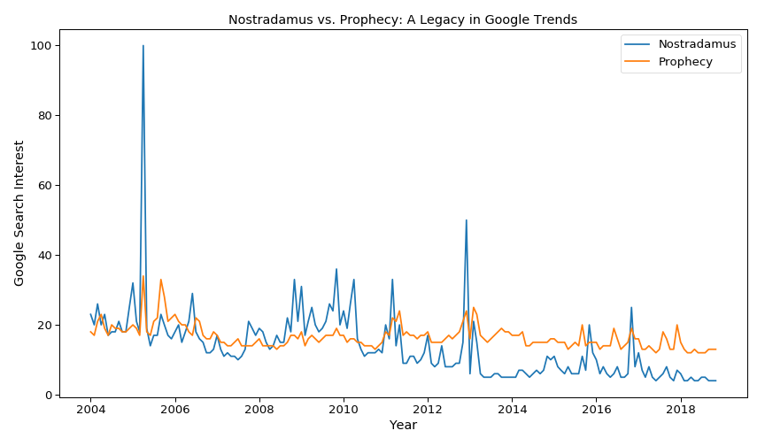
The chart below shows that the word “Nostradamus” has had a higher Google search volume than “prophecy” itself during several periods since 2004.

Using truncated singular value decomposition (SVD) with a term frequency-inverse document frequency (TF-IDF) vectorizer, I reduced the 770 words of “Les Propheties” into three distinct topics. A TF-IDF worked well with this corpus because Nostradamus repeats very few words in his prophecies.
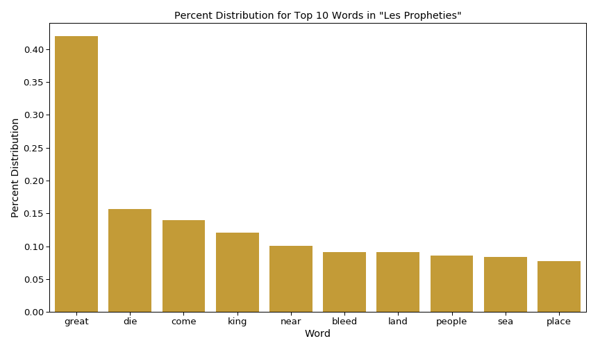
The chart below depicts the top words used in “Les Propheties.” Across all 942 prophecies, only one word is used in more than 15% of the prophecies.

Listed below are the three distinct topics extracted from truncated SVD. The titles represent my own interpretation of that topic’s top words.
- Topic 1: Doom to a Kingdom by War/Attack
- Top Words: great, die, come, king, land, near, bleed, sea, people, long
- Topic 2: Conspiracy Against the King
- Top Words: die, king, time, bleed, long, realm, year, capture, life, conspirator
- Topic 3: Doom to a Kingdom by Nature
- Top Words: land, die, sea, bleed, fleet, near, water, sudden, far, tremble
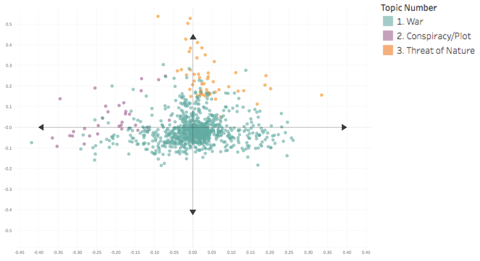
At this point, I had three separate weights for each prophecy, which corresponded to each prophecy’s distribution among the three distinct topics. To visualize this distribution, I went through each prophecy and identified the topic with the maximum weight. The topic with the maximum weight for each prophecy would determine its color in the chart. Then, I used principal component analysis to reduce the dataset of weights from three dimensions to two dimensions.
The chart below (created in Tableau) shows this distribution of topics across all 942 prophecies, with the topic that received the maximum weight determining the color for a given prophecy.

From the chart above, I saw immediately that Topic 1, which I had titled “Doom to a Kingdom by War/Attack,” was the dominant topic for the majority of Nostradamus’ prophecies. Topics 2 and 3 were each the dominant topics for fewer than 100 prophecies. What I found most interesting though was to see how well these three topics were separated in a two-dimensional space. Prophecies dominated by Topic 1 hovered around the center of the chart, while prophecies dominated by Topics 2 and 3 filled the left and top of the chart respectively.
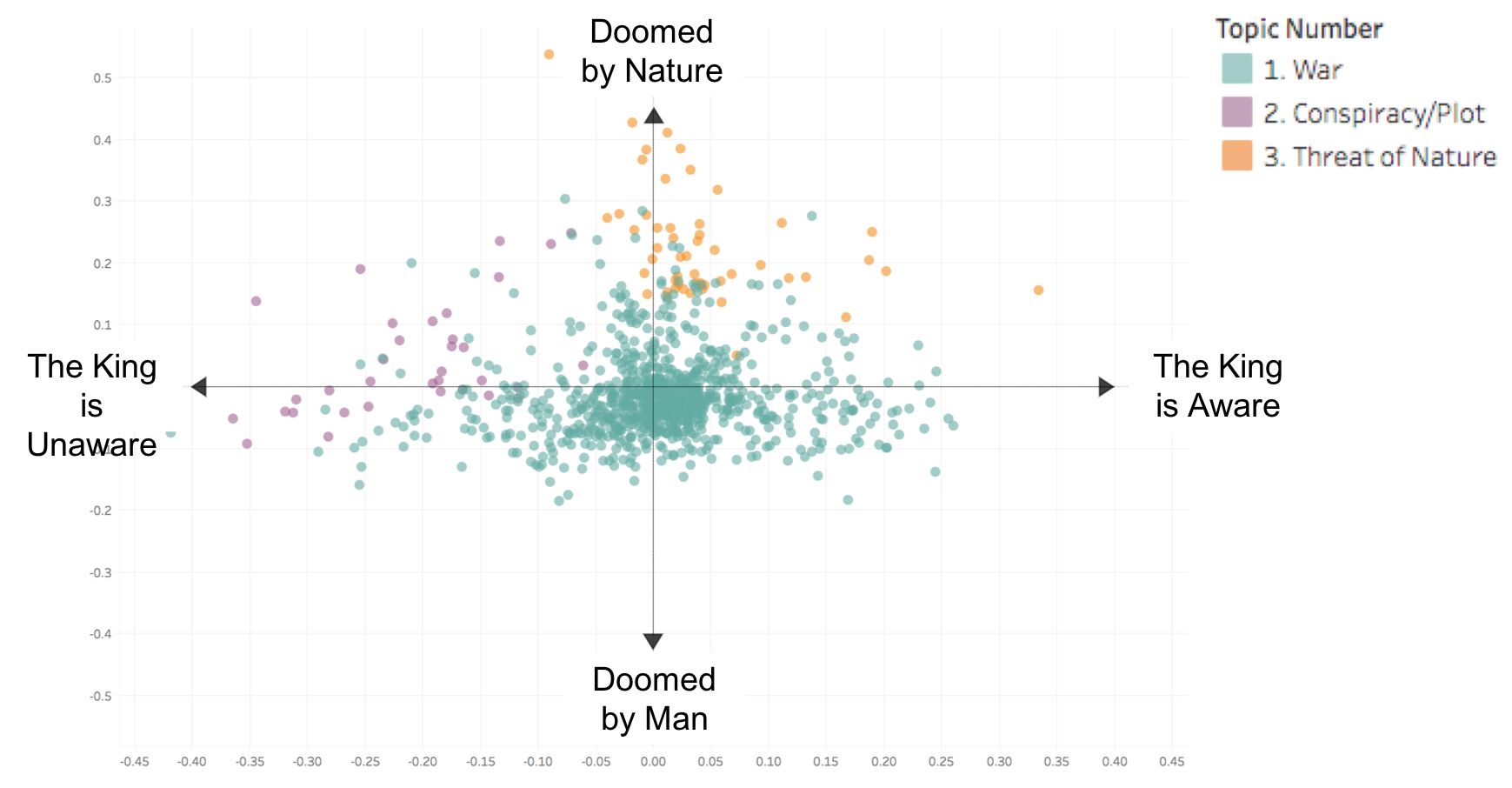
To interpret what it means for a prophecy to fall at a specific location on this chart, I decided to name the axes themselves, according to how the topics were separated.
The chart below (created in Tableau) shows this final result of naming the ends of each axes to interpret the points.
